
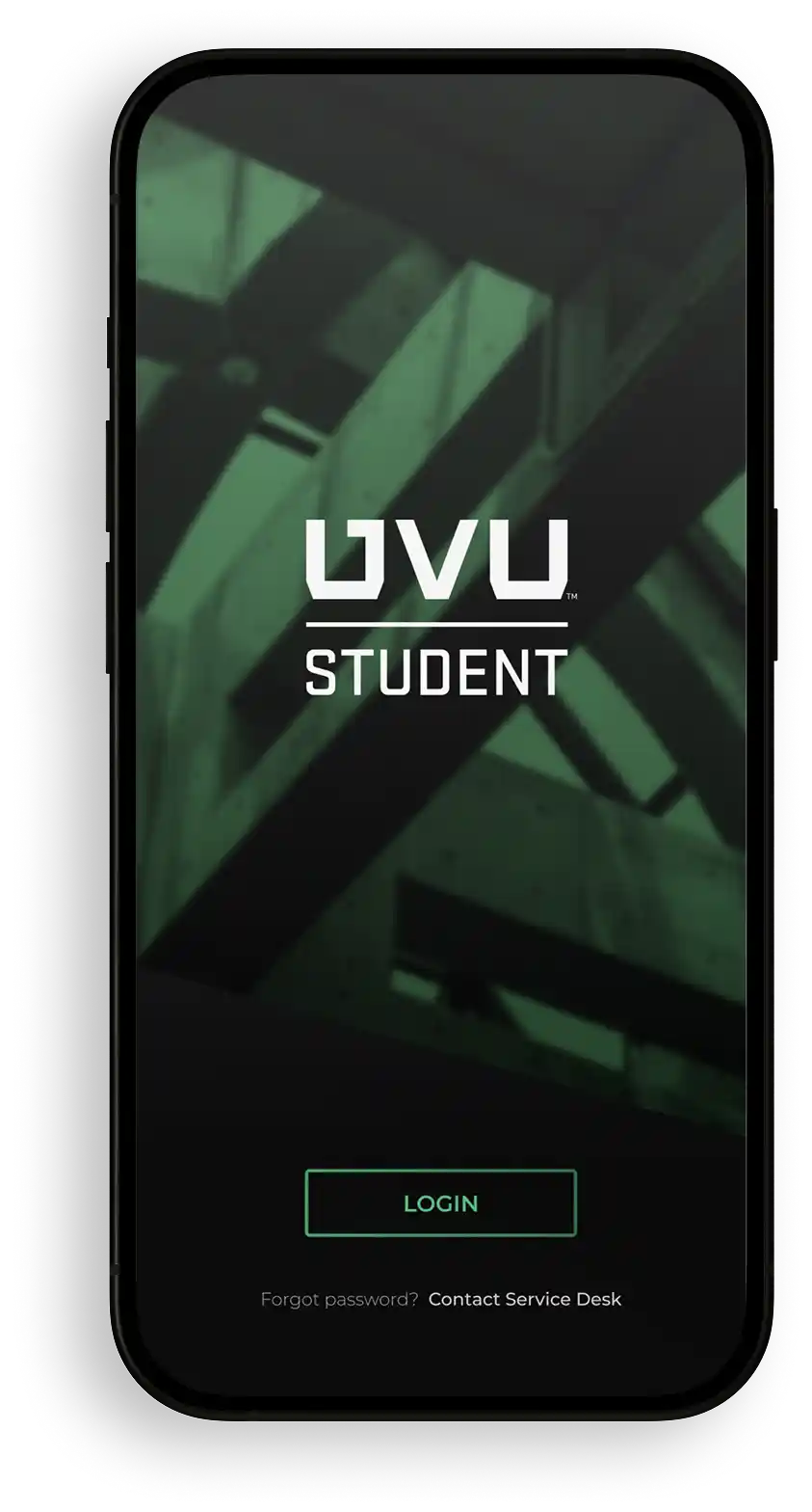
Student
Mobile App
Project Overview
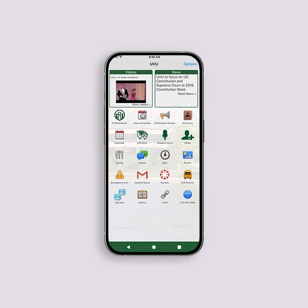
The UVU Student Mobile App project addressed a critical challenge for Utah Valley University, a large institution with over 44,000 students: a fragmented and outdated digital ecosystem that burdened students with disconnected systems for essential tasks. As Creative Lead, I directed a team of three designers to reimagine UVU's digital experience, designing an intuitive mobile interface that unified key services like tuition payments and class registration. Our solution transformed institutional pain points into a seamless student journey, setting a new benchmark for digital innovation at UVU.
A Lightweight Student First Design
Our research—combining student interviews, support ticket analysis, and competitor reviews—revealed critical gaps in higher ed digital tools. Beyond addressing frustrations, this project positions UVU as a leader in student-centric innovation, offering a competitive edge in attracting and retaining students through a seamless, modern experience.
User Personas

Key Needs: Guidance on college applications, financial aid, and accessible transit.
Pain Points: Lack of career path clarity, confusion about applications, financial barriers.

Key Needs: Navigating campus, managing finances, tech-forward tools for daily tasks.
Pain Points: College costs, difficulty finding campus resources, financial planning.

Key Needs: Efficient tools, childcare support, simple financial planning, and academic guidance.
Pain Points: Limited time, hard-to-find resources, financial pressure, and heavy workload.
System Audit & Key Findings
We collaborated with UVU to confirm a common student need: a unified platform for schedules, deadlines, and alerts.
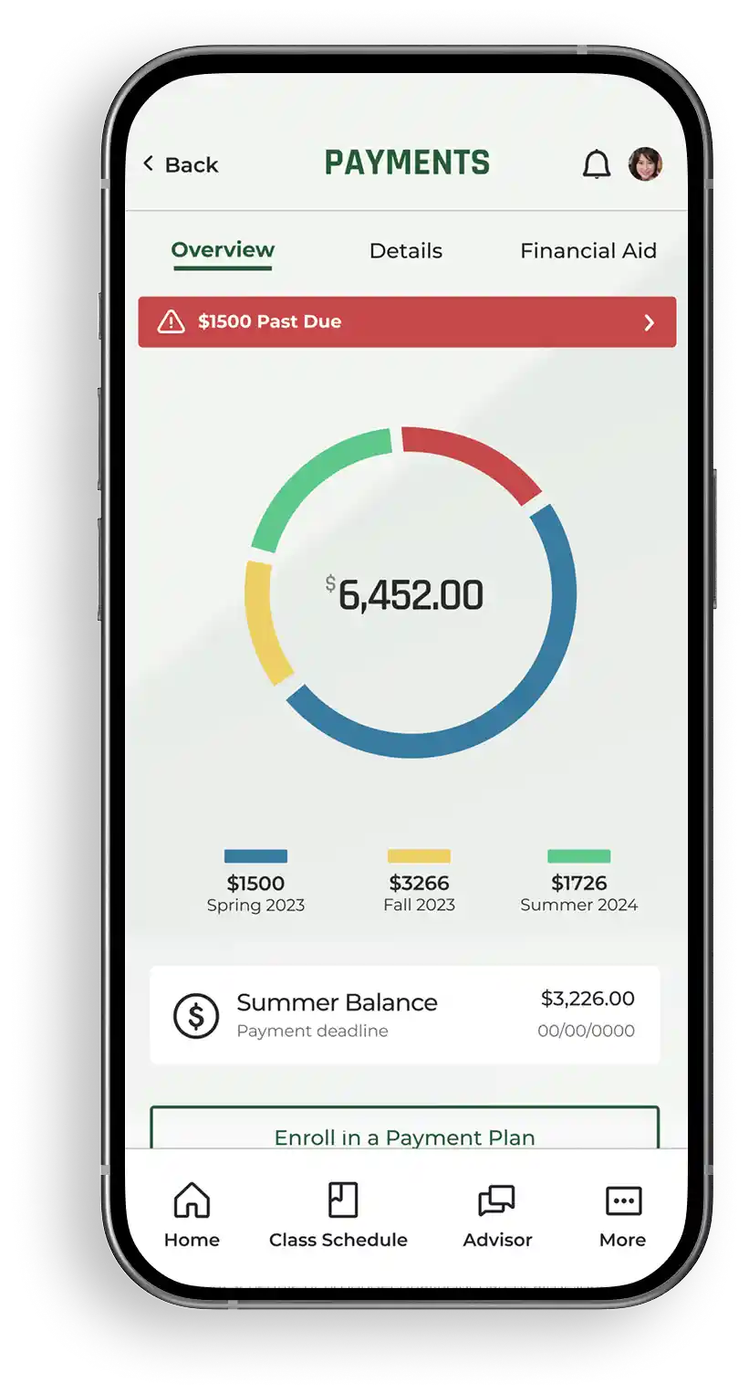
Fragmented platforms and multiple logins for essentials like Greenbucks and financial aid frustrated UVU students. The university aimed to unify access under one login.
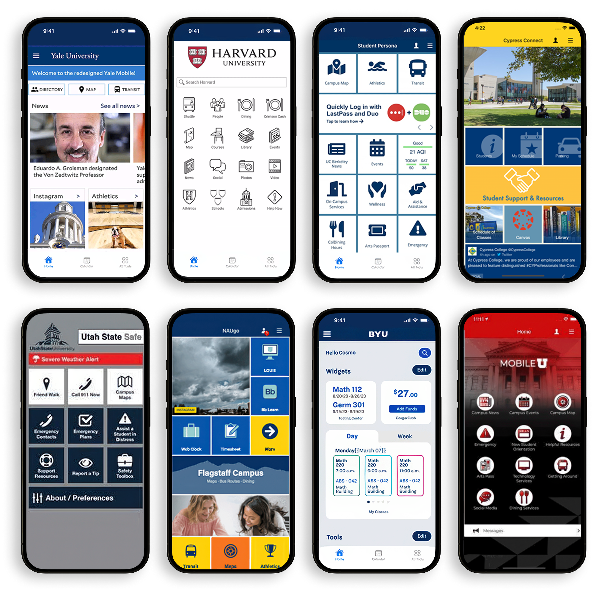
Analysis of eight peer schools revealed outdated, fragmented apps. UVU aimed to set a new standard with integrated calendars and personalized alerts to boost enrollment and engagement.

Password issues made up 40% of support tickets. A simpler login cuts staff load and enhances the student experience, reflecting UVU’s commitment to accessible, modern service.
Understanding Student Needs for Digital Service Innovation
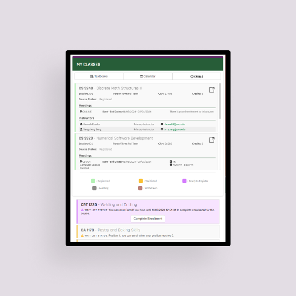
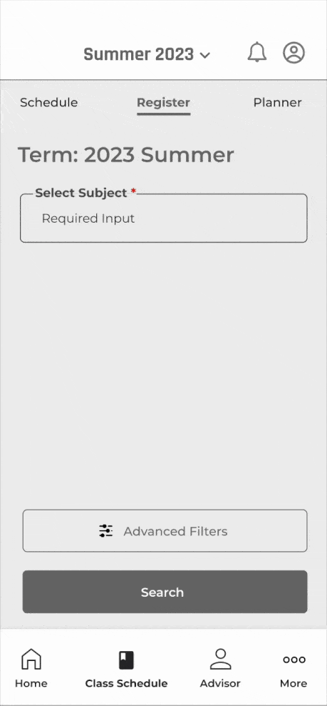
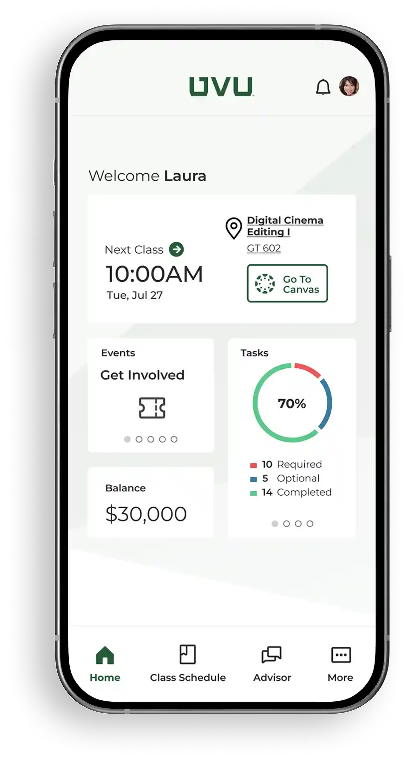
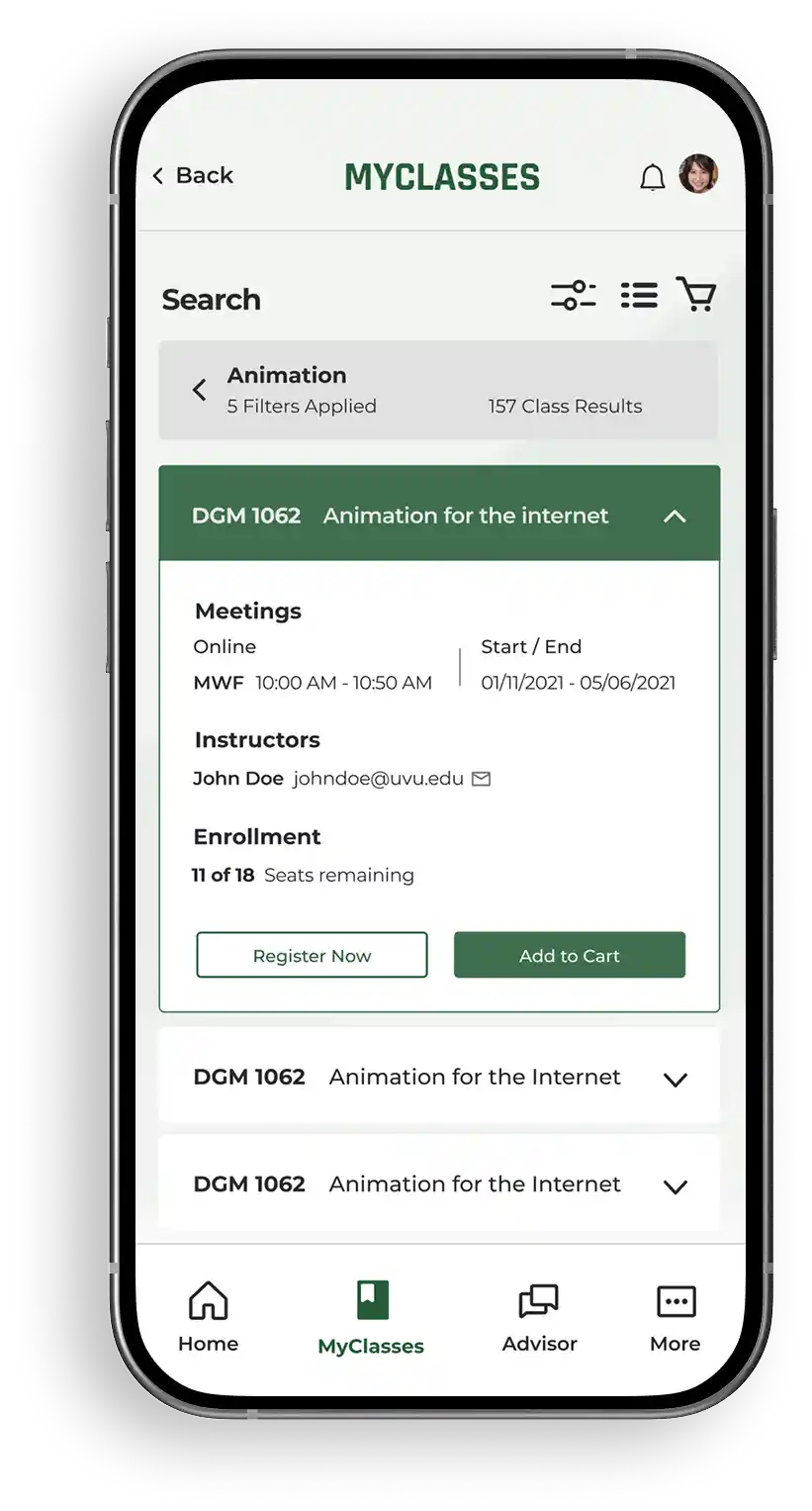
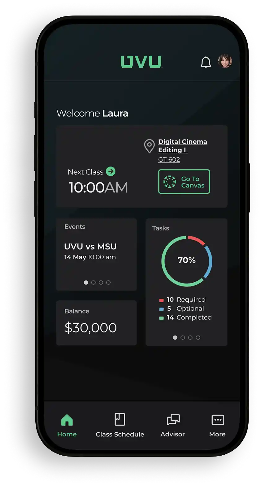
Leveraging research insights, we developed low-fidelity wireframes to address critical student needs. This resulted in an intuitive flow for class registration, course search, schedule building, and payments, alongside centralized resource access. These foundational wireframes evolved into clickable prototypes, refined through usability testing to ensure key features were accessible within two taps.
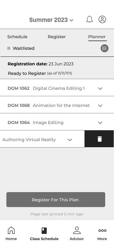
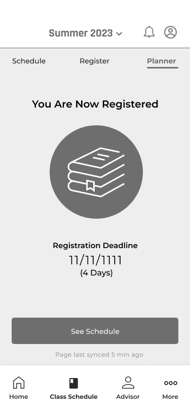
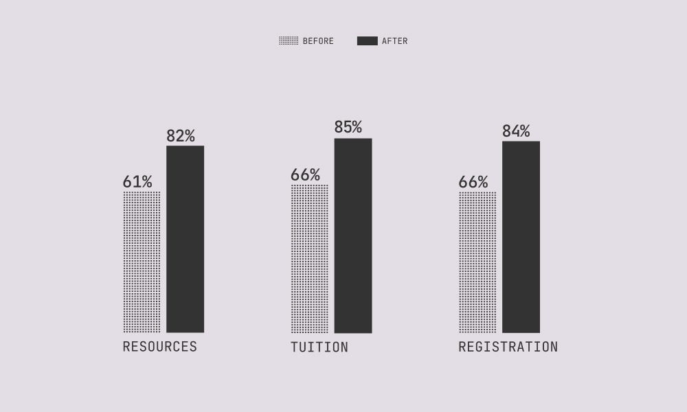
Testing with 30 students helped simplify payments, clarify scheduling conflicts, and improve wording. Task completion jumped from 61% to 85%, showing the power of iteration in refining workflows.
A Lightweight Student First Design
Building upon foundational research and iterative wireframing, our visual design phase transformed functional prototypes into a refined, engaging, and intuitive digital experience. We prioritized clarity, consistency, and accessibility, ensuring the interface not only looked appealing but also facilitated seamless user interaction and strengthened the UVU brand. Every visual decision aimed to enhance usability, reduce cognitive load, and create a modern aesthetic that resonates with UVU's diverse student body, delivering a familiar yet fresh product.
Design System & Principles

A consistent and intuitive icon set, meticulously refined for mobile screens, ensures clear visual communication and a seamless user experience across the application.

Adapted from existing UVU marketing colors, this palette is carefully curated for brand consistency and ensures AA compliance for optimal contrast and readability in both light and dark modes.

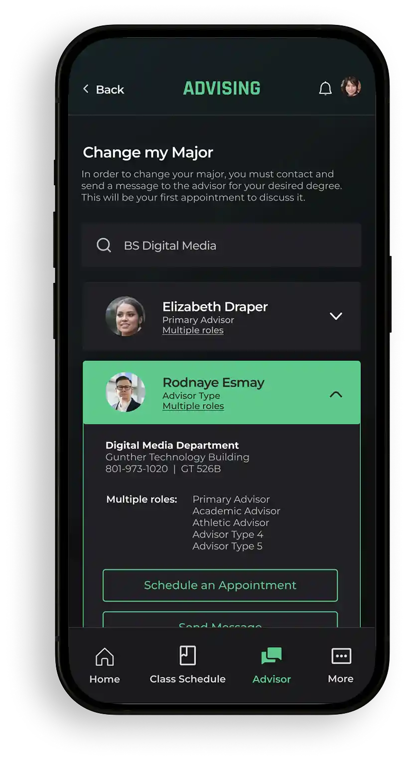
These foundational components, including interactive accordions and the digital ID, provide a consistent user experience designed to reduce cognitive load and simplify complex information.
Core Visual Elements
Refining the Student Experience:
From Complexity to
Clarity
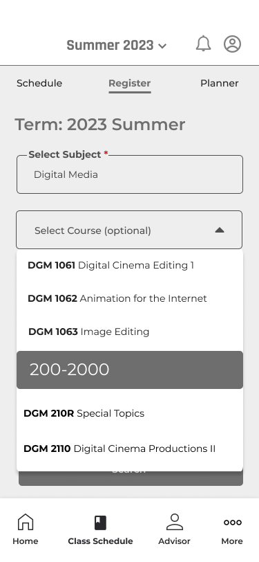
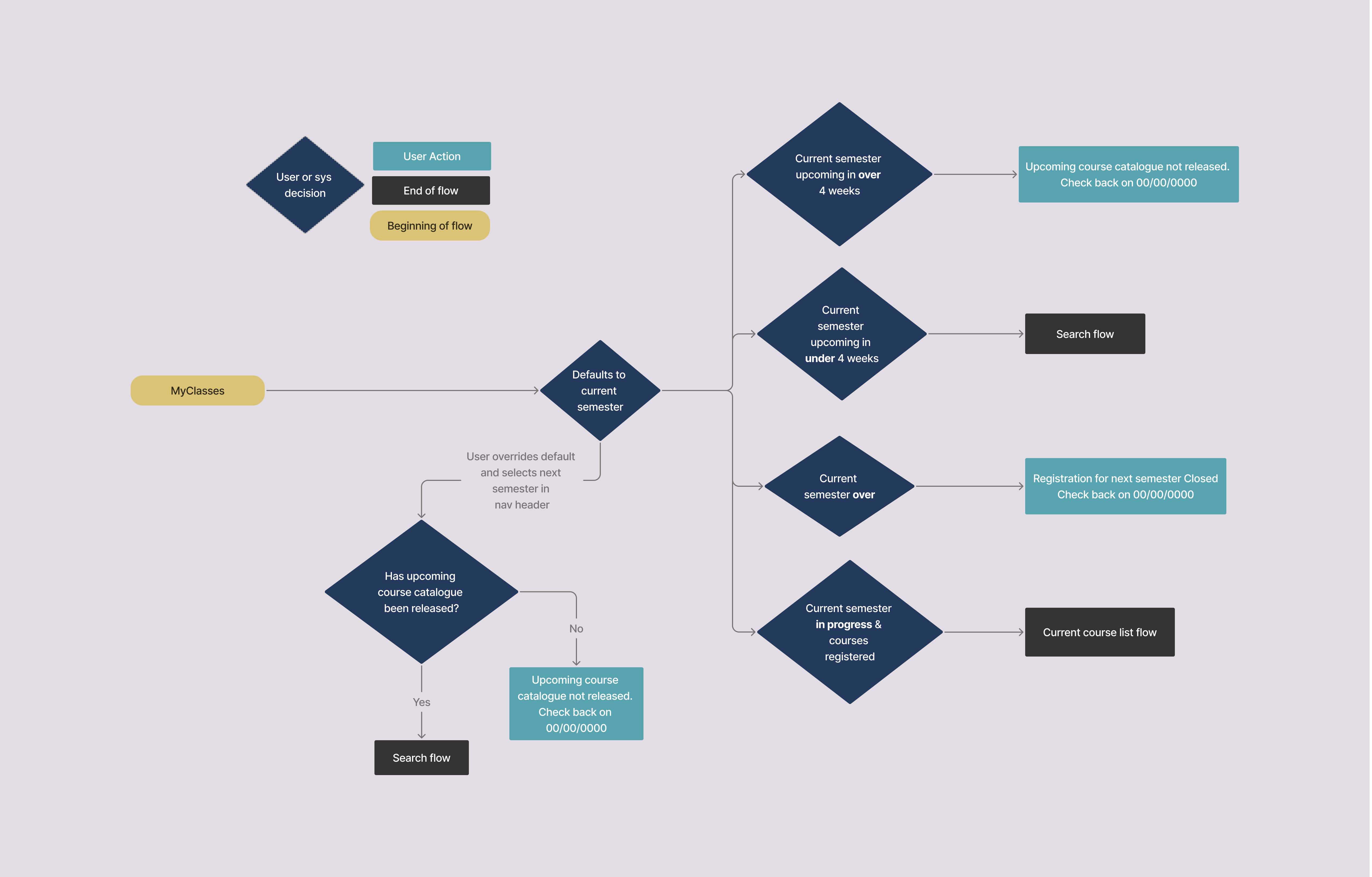
Initial prototypes clarified key flows, but testing revealed persistent confusion around semester options and navigation labels. After presenting findings to stakeholders, we aligned on a more impactful fix—removing 60% of navigation choices and letting backend logic determine visible options based on term dates. This dynamic approach streamlined the experience and cut click paths by 40%, with zero observed frustration.
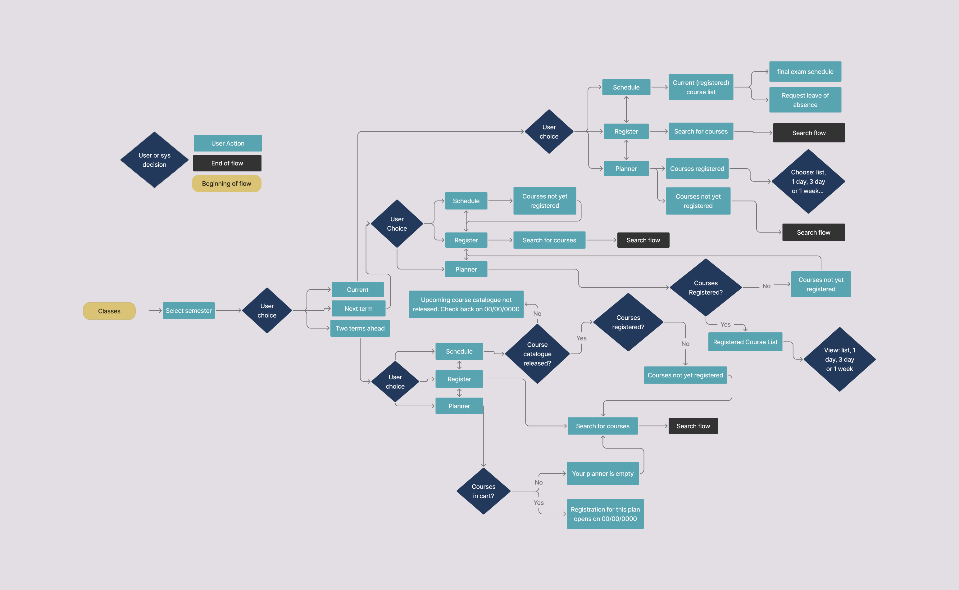

Inconsistent labels like “Register” vs. “Schedule” and too many semester options caused confusion and backtracking, especially during registration.

We reduced navigation options by 60%, used clearer labels, and aligned flows with academic timelines. Testing showed 40% shorter click paths and no signs of user frustration.
Conclusion & Things Learned
Our research—combining student interviews, support ticket analysis, and competitor reviews—revealed critical gaps in higher ed digital tools. Beyond addressing frustrations, this project positions UVU as a leader in student-centric innovation, offering a competitive edge in attracting and retaining students through a seamless, modern experience.
Key Takeaways
Original User Flow
Users struggled with the original navigation's
inconsistent naming. The 40% drop in support tickets proved
simplicity wins
Constraints Breed Creativity
Working within UVU's legacy tech stack forced
smarter solutions—like repurposing existing APIs for
mobile-first workflows.
.
Data Bridges Gaps
When
bureaucracy stalled decisions, usability metrics (like the
65% label confusion rate) became our universal language.
Done is Better than Perfect
Launching the MVP fast let us refine with real-world
insights, like adding the digital ID card only after proving
core value successfully.
Future Outlook & Continued Impact
Building on this strong foundation, future iterations will explore integrating a personalized academic advisor chat and expanding digital ID card functionality. Continuous user feedback will guide our ongoing efforts to ensure the app remains a vital resource for UVU students.